


Cover Stories
Is there truth in the old adage that we should never judge a book by its cover?

When my Italian book club met last week there was a general sense of disappointment in our chosen reading, Al giardino ancora non l’ho detto (I Haven’t Told My Garden Yet) by Pia Pera. The title comes from Emily Dickinson’s poem:
I haven't told my garden yet—
Lest that should conquer me.
I haven't quite the strength now
To break it to the Bee—
One of the group felt particularly let down because she had liked the cover of the book. And indeed it is very attractive:
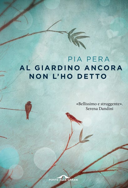
It appears that most of us ignore the warning not to judge the content by the cover, driving modern publishers to find ways to make their latest offering stand out on very crowded, even garish, shelves.
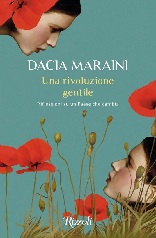
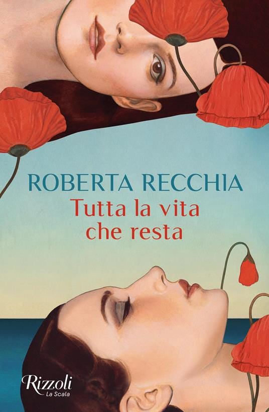
There are as many trends in this field as in any other. For a previous book club recommendation, I jumped onto the Feltrinelli site to buy a book of essays by Dacia Maraini but what turned up in the post was a novel by Roberta Recchia. Like an eejit I had clicked on a book whose cover resembled Maraini’s. Both were published by Rizzoli.
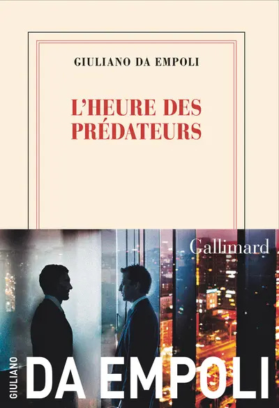
French publisher, Gallimard, however operates a strict no pictures policy for its trademark parchment and red jackets, although it will occasionally add a colourful glossy band, which falls off as soon as you open the book.
When my first novel, Breaking Out, was published by Blackstaff Press, the cover featured a young woman who worked in Waterstones in Belfast. Readers who didn’t know me assumed she was me. Later, when Blackstaff was bought out by Baird’s, the novel was reissued with a sexed-up cover, featuring the same girl but set against a pastel blue background with gold embossed lettering. It was an attempt to pass the novel off as chick lit. Sadly for me, the ploy didn’t work.
Certain poet friends of mine are very particular about the image (usually a painting) that graces the covers of their collections. James Joyce, notoriously superstitious, took comfort from the coincidence of his books’ publication dates with birthdays of family and friends. He arranged for Ulysses to be published on his birthday, 2 February, and insisted that it be bound in blue with white lettering. This, according to his biographer, Richard Ellman, ‘he considered lucky for him, and suggested the myth of Greece and of Homer, the white island rising from the sea.’ Ellman notes too that the precise shade of blue was mixed by Joyces’ artist friend, Myron Nutting, because the binders could not ‘get it right’.
Visual artist, Caroline Ward, recently began to make works using old cloth bindings when she noticed that with time they acquired interesting variations and patterns of fading and foxing.

She adds interest to the back of the work too, replicating the adventure of reading a physical book, one worth memorialising as digital and audio forms gain in popularity.
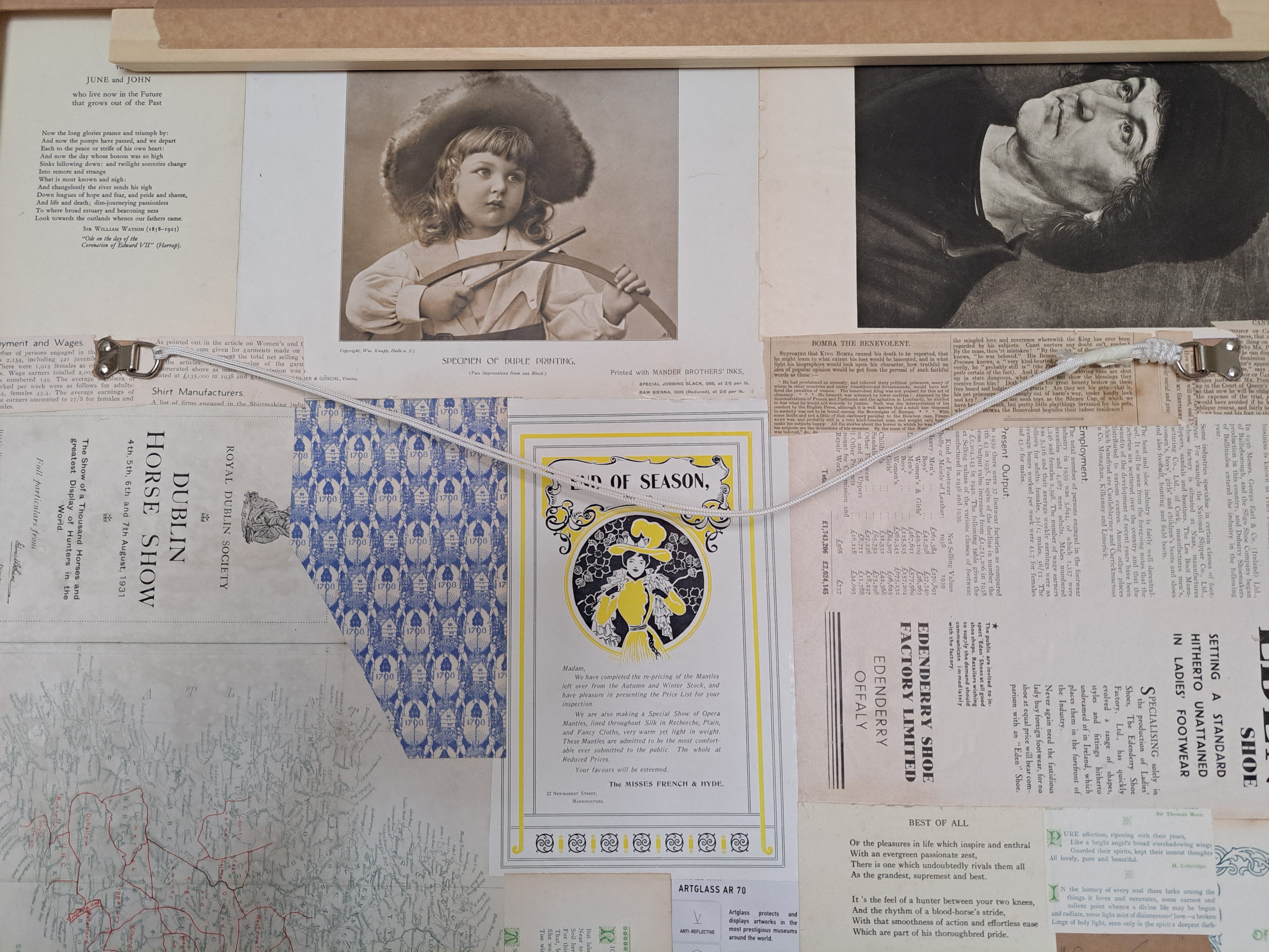
Those nineteenth and early twentieth century volumes did not vie for our attention as modern ones do. They were outwardly plain but inside they often featured bright coloured plates and line drawings, such as the famous sketches by George Cruikshank illustrating Dickens’ novels. Or this, from an edition of Thackeray’s The History of Henry Esmonde published by the Literary Guild of America in 1950.
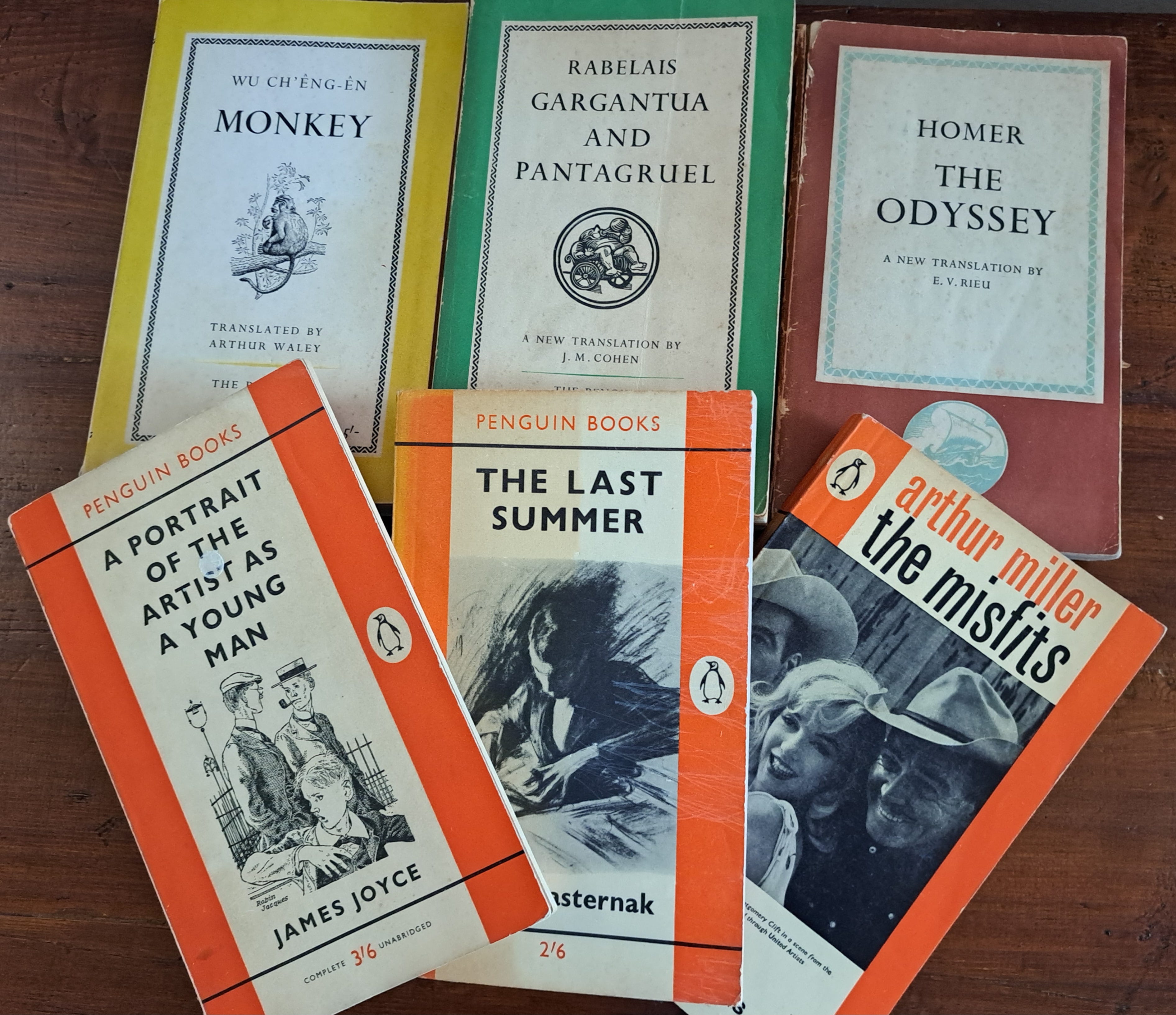
In 1935, along came a flock of paperbacks, Penguin, followed by Pelican and Puffin, each series with distinctive designs, colour-coded by topic, Penguin’s orange for general fiction, dark green for detective stories, red for drama, and a mix for translated classics. The pale blue Pelicans were non-fiction, and Puffins pleased the kids. (I was a proud member of the Puffin club as a child.) Nowadays you can buy any amount of Penguin merch stamped with reproductions of those early covers.
It used to be said that you could tell a lot about a person by the bands of colour on their bookshelves. A case of judging the reader by the covers of their books. [1]
Shakespeare’s phrase, ‘There is no art to find the mind’s construction in the face’ (Macbeth I:iv) notwithstanding, we are as likely to judge people by their looks as we are books by their covers. Fiction writers play on this tendency, offering clues to their characters by describing their outward aspect, especially their clothes, the human equivalent of a book’s cover.
Here is our first sight of John Le Carré’s famous hero:
Small, podgy, and at best middle-aged, he was by appearance one of London’s meek who do not inherit the earth. His legs were short, his gait anything but agile, his dress costly, ill-fitting, and extremely wet. His overcoat, which had a hint of widowhood about it, was of that black loose weave which is designed to retain moisture. . . . For reasons of vanity he wore no hat, believing rightly that hats made him ridiculous.
(Tinker, Tailor, Soldier, Spy)
The cover of this edition (Bantam, 1975) features a photograph of Alec Guinness in the role of Smiley for the BBC/Paramount TV production. Le Carré plays with our quick and lazy judgements by showing us a humble, somewhat silly man, wearing exactly the wrong coat on a rainy day, of whom, therefore, we would not expect much. Big mistake!
By contrast, Jhumpa Lahiri epitomises her eponymous character in the story ‘When Mr. Pirzada Came to Dine’ by his outward form:
He stepped into the foyer, impeccably suited and scarved, with a silk tie knotted at his collar. Each evening he appeared in ensembles of plums, olives and chocolate browns. He was a compact man, and though his feet were perpetually splayed, and his belly slightly wide, he nevertheless maintained an efficient posture as if balancing in either hand two suitcases of equal weight.
The paragraph occurs early in the story of a Pakistani academic working in America where he is a regular visitor to the home of an Indian colleague. It is 1971 and their two countries are edging closer to war. The appetising colours of Mr. Pirzada’s clothes chime with his generous gifts of sweets for his host’s daughter, the two suitcases reflect the counterweights of his tenure in the US and his absence from his family, especially his own daughters, the recent division of his homeland and, therefore, his loyalties.
There is an art to this form of description, which hovers between bringing us into the scene and allowing our imaginations fill the gaps or flesh out the character and the setting. Too much information can deaden the experience. Likewise, a cliché tells us nothing. We need the precise telling detail. Tolstoy is a master of presenting a living, breathing character, usually by way of gesture.
This is Vronsky’s first sighting of Anna Karenina at the railway station where, some years later, and after the failure of their affair, she would take her own life:
Mme. Karenina did not wait for her brother, but, on seeing him, got out of the carriage with a light, resolute step. And as soon as her brother came up to her, she threw her left arm around his neck in a movement that surprised Vronsky by its resoluteness and grace, quickly drew him to her and gave him a hearty kiss. Vronsky, not taking his eyes away, looked at her and smiled, himself not knowing at what.
Her spontaneity and resoluteness will be her undoing but, like Vronsky, we do not know that yet and so we are swept along by his fascination.
Oddly, the cover of my 2003 Penguin edition of the novel features a detail from a portrait of Mrs. Wilton Phipps by John Singer Sargent: a woman’s bosom encased in a black and white bodice, bejewelled hands clasping a flower to her bare chest. Suggestive and alluring maybe to some, but the absence of the woman’s head feels wrong for many obvious reasons.
The cover of a book is not a mere wrapping to protect the pages, but with the right image(s) should lift the veil on the world it contains and beckon us within.

Forgive me if I shamelessly add a picture of the cover of my novel, Lena’s House, published this month three years ago. The illustration was made by my talented friend Mark Cooney. The moment I saw it among his beautiful images I knew it was perfect for my book.

In the interests of research I studied the window display of my local bookshop today. It was in two parts, one side devoted to travel and anthropology, the covers of the former mostly decorated with twee pastiches of vintage railway posters or Edwardian samplers. On the other side were children’s books. My favourite of these titles was Easter Bunny’s Wobbly Bottom, with a blue posterior and white bobtail on display.
May chocolate bunnies rain down on you this week, dear Readers.
[1] https://www.colourstudies.com/blog/2019/8/13/penguin-book-covers
Thank you and for that anecdote. What an amazing and appalling story. The racist implications of the spin are quite shocking. Happily those days are behind us now . . .
Thanks Vincent. Very interesting story about Paul Lynch and the Prophet Song cover. Yes it is unusual for a cover to cross borders. Different markets tend to have different tastes and hence to favour different styles of cover. The Prophet Song cover is very striking and memorable. As is the novel itself.